Redesigning UX Playground's website
Key learnings
Working with a content strategy was the most valuable learning I had with this project. Starting the design process with words alone was a very effective approach to communicating ideas and concepts quickly. We were able to clearly define the goals early and had the flexibility to refine and remove anything irrelevant. Using real content also provided better context and storytelling, which reduced the development time of the website and therefore a faster launch of the new website redesign.
Overview
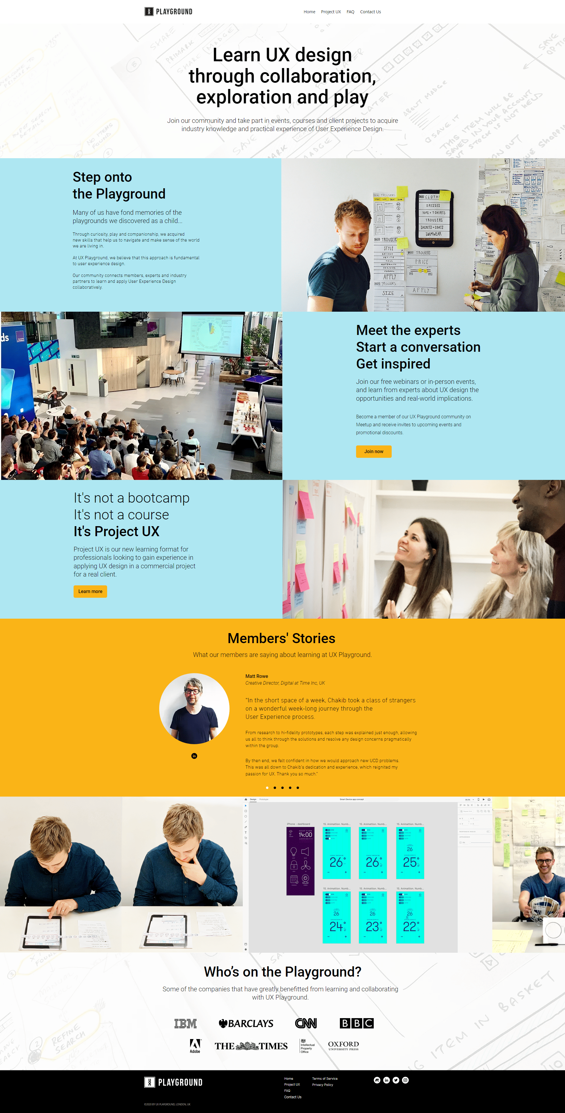
UX Playground is a design community for professionals, experts and industry partners to collaboratively learn about User Experience Design. The community is about connecting people and knowledge sharing through events, courses, workshops and client projects.
Website redesign
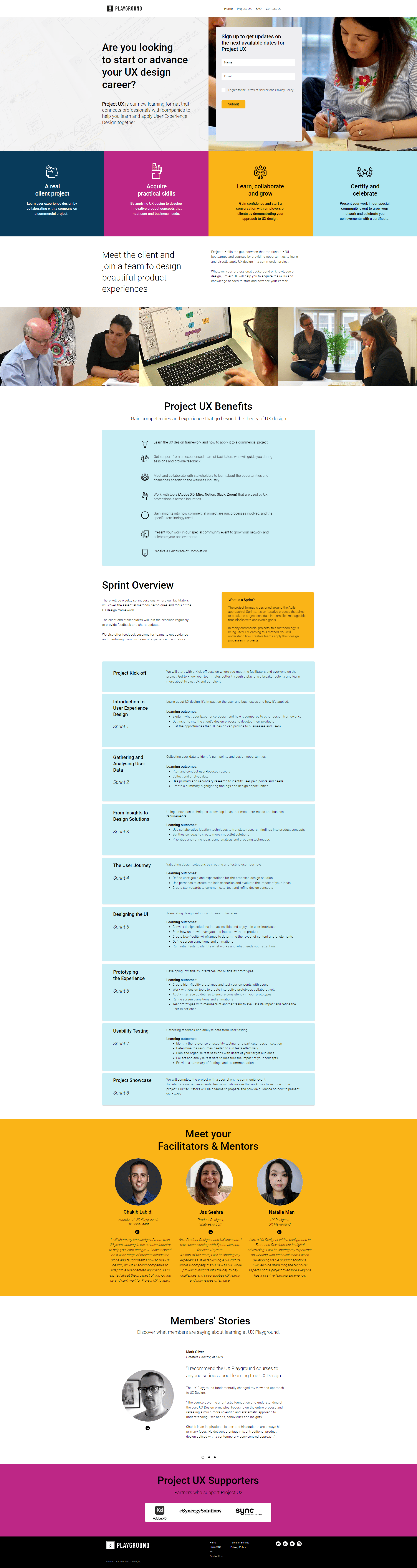
Our goal was to create a new website design using UXPG's new branding guidelines and with the following requirements:
- To help promote the UX Playground community and its offering of events, courses and client projects.
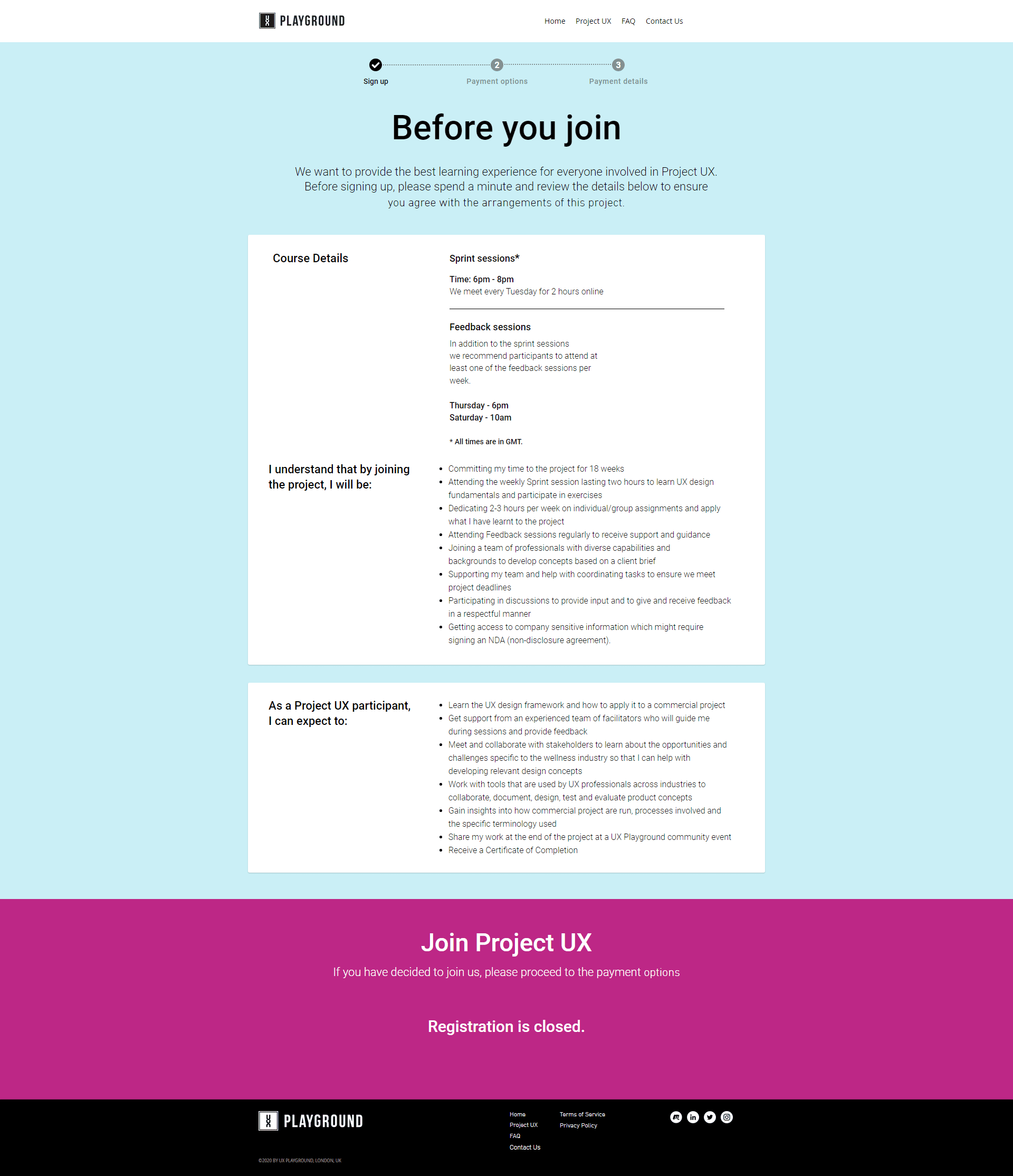
- A registration process for people to join Project UX.
- Allow visitors to contact UX Playground for any queries they have.
Key stats
Since the launch of the new design, in 6 months the website had:
- Increased visitor traffic by 151%.
- Increased website sessions by 227%.
- Increased pageviews by 294%.
In 2021, with our community events done remotely we also utilised other channels apart from Meetup.com to promote events. Data showed that:
- Other website referrals increased by 15%.
- Social media referrals increased by 12% (LinkedIn, Facebook, Twitter).
- Direct traffic increased by 43%.
Overall, this suggests that by promoting the website across multiple channels helps to raise awareness of UX Playground's content and design community.
Team
Natalie H. Man, UX Designer, Freelance
Chakib Labidi, Senior UX Designer and UX Playground founder
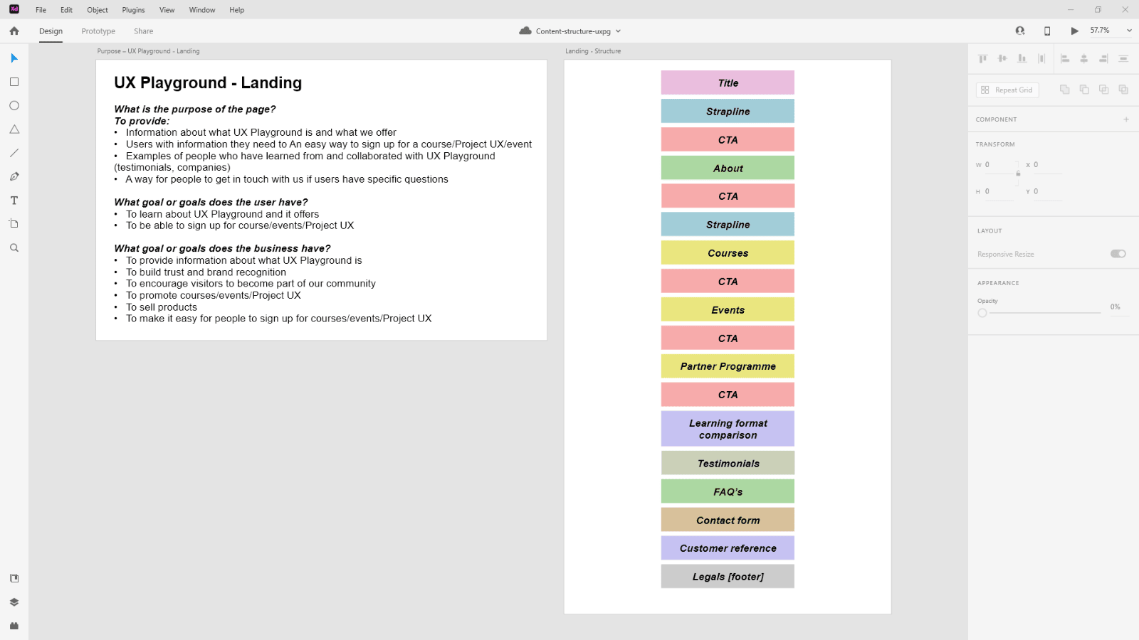
Content before aesthetics
Using the Priority Guide framework, we identified the goals for each page of the website. As a team, we would review and refine the structure according to the defined goals.
Personally, this process made content creation more efficient and enjoyable because the goals are defined early and I was constantly considering whether what I write is relevant to the page. Additionally, starting with content first enabled us to quickly validate the information and reprioritise if we find anything that is irrelevant or too much. We were also more focused on the business and user goals, and not getting distracted by the visual elements/layouts.
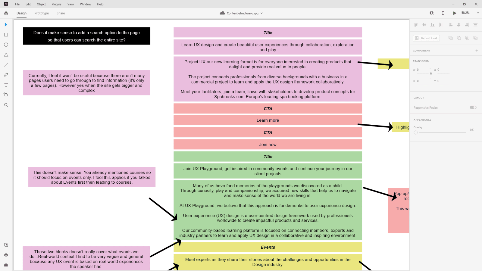
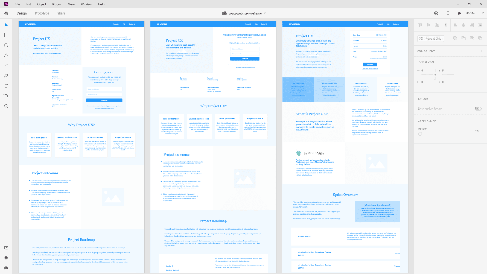
Wireframing with content
Whilst my team works on the content, I focused on creating low fidelity prototypes of the new pages using Adobe XD’s wireframe kit. This process was unexpectedly easier when using the content we created. With clearly defined goals and context, multiple variations of a page design can be created quickly. The reviewing process was also efficient and allowed us to start the development process sooner once the final design was selected.
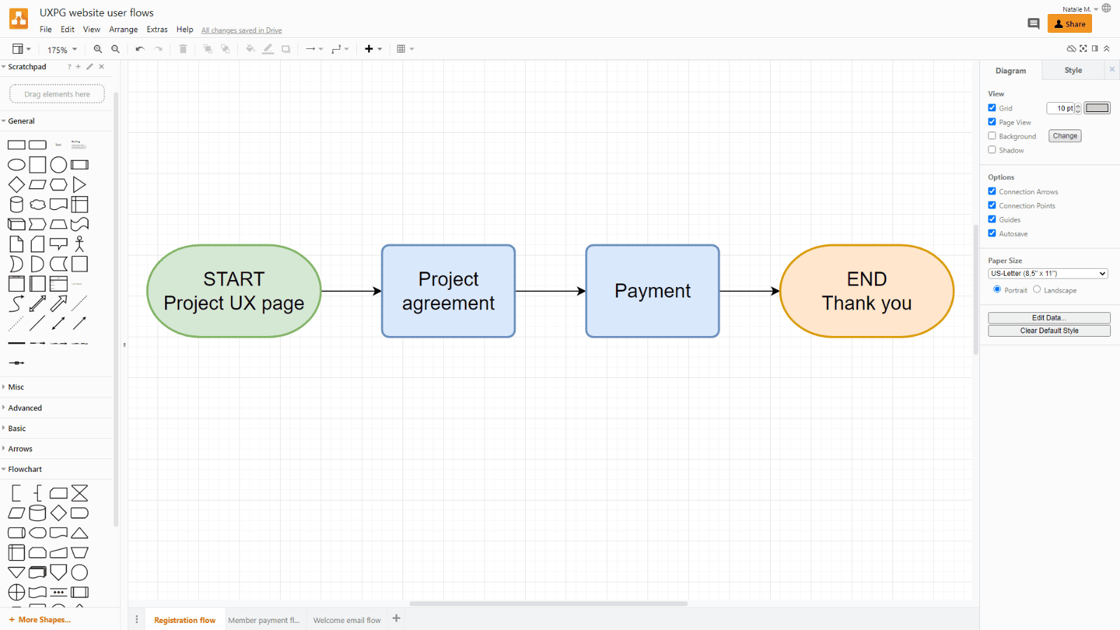
Mapping the user experience
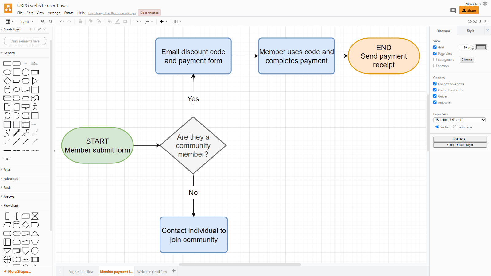
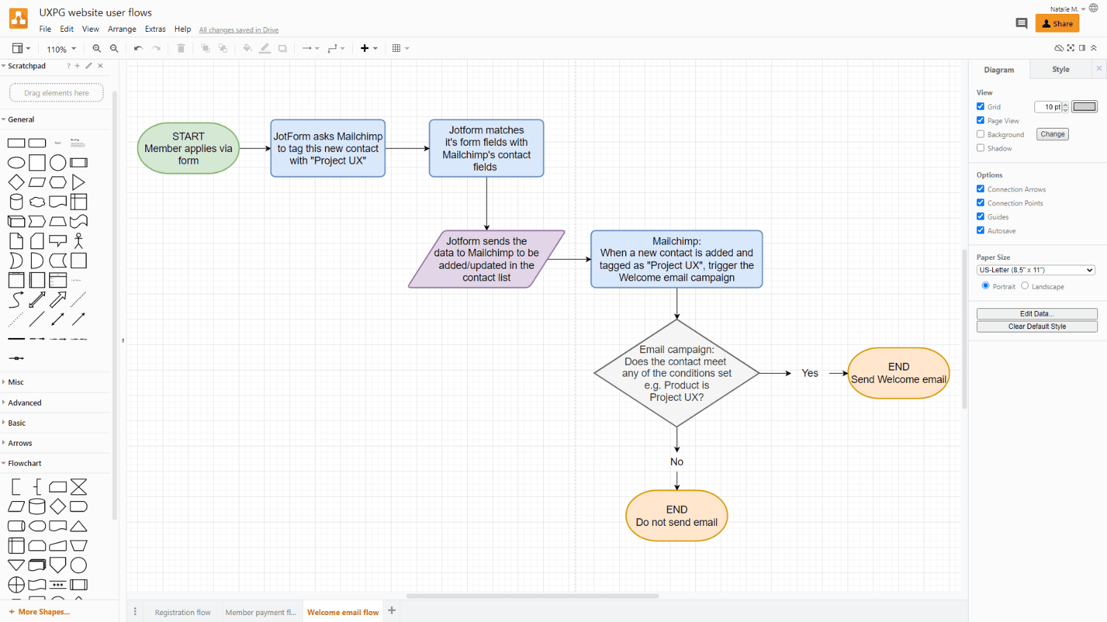
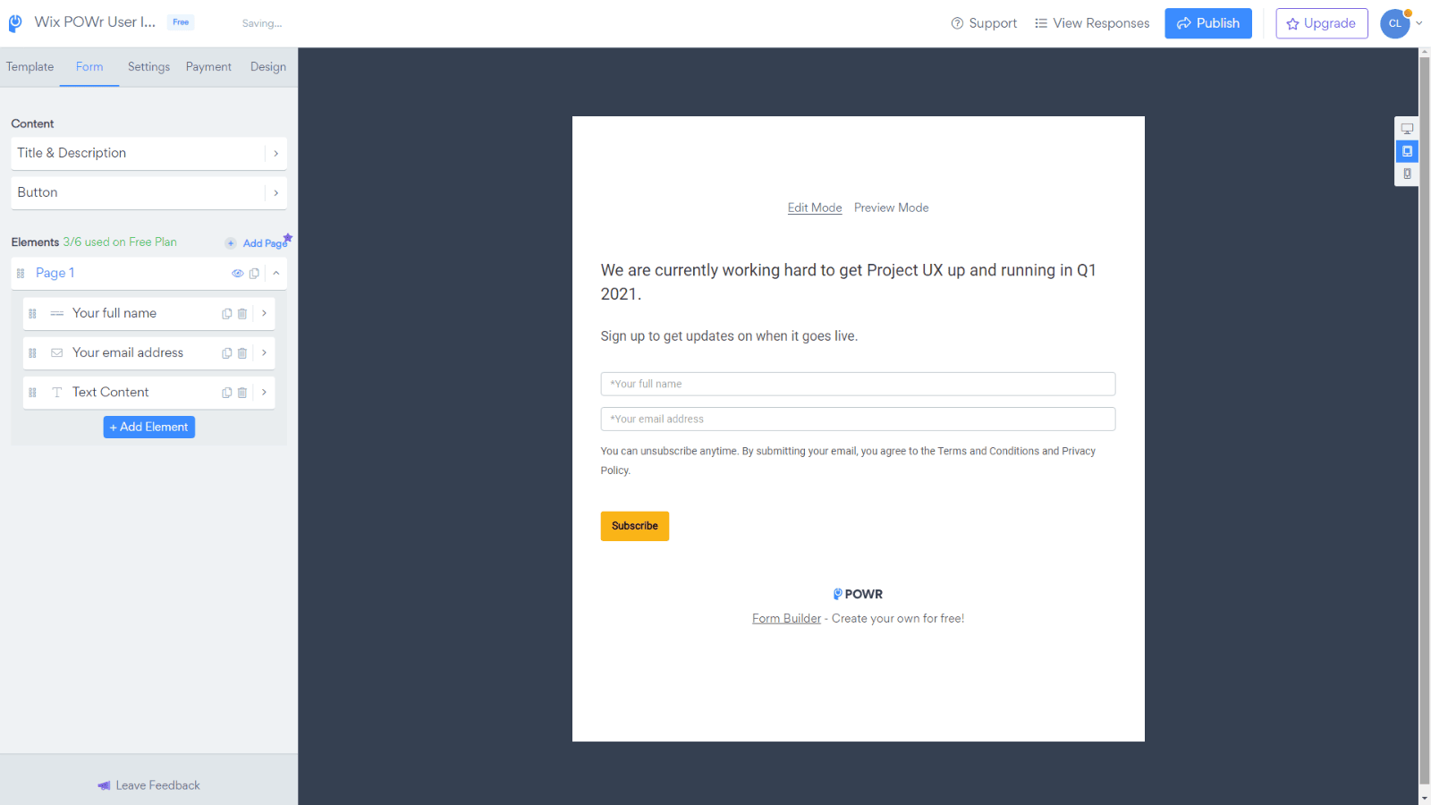
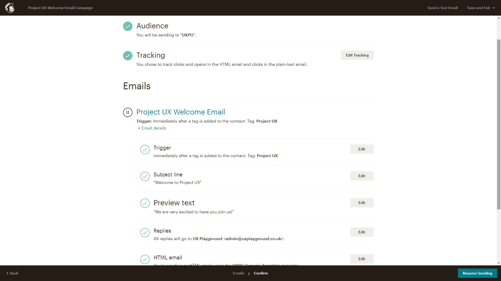
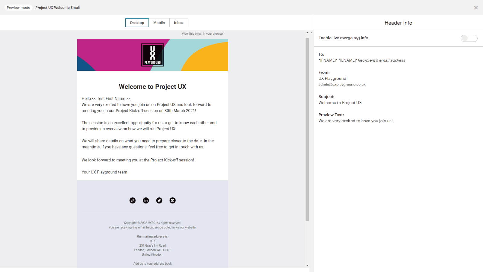
One of the requirements was to enable people to register for Project UX. To understand how the process may work, I have created the following user flows:
- Registering for Project UX
- Members paying for Project UX
- Welcome email campaign after joining
They were useful in highlighting any considerations we may have missed e.g. what happens after a user registers, additional pages etc. For website development, it was used to determine what plugins/tools was required and for prioritising my tasks.
Website development
For the website, the following were implemented:
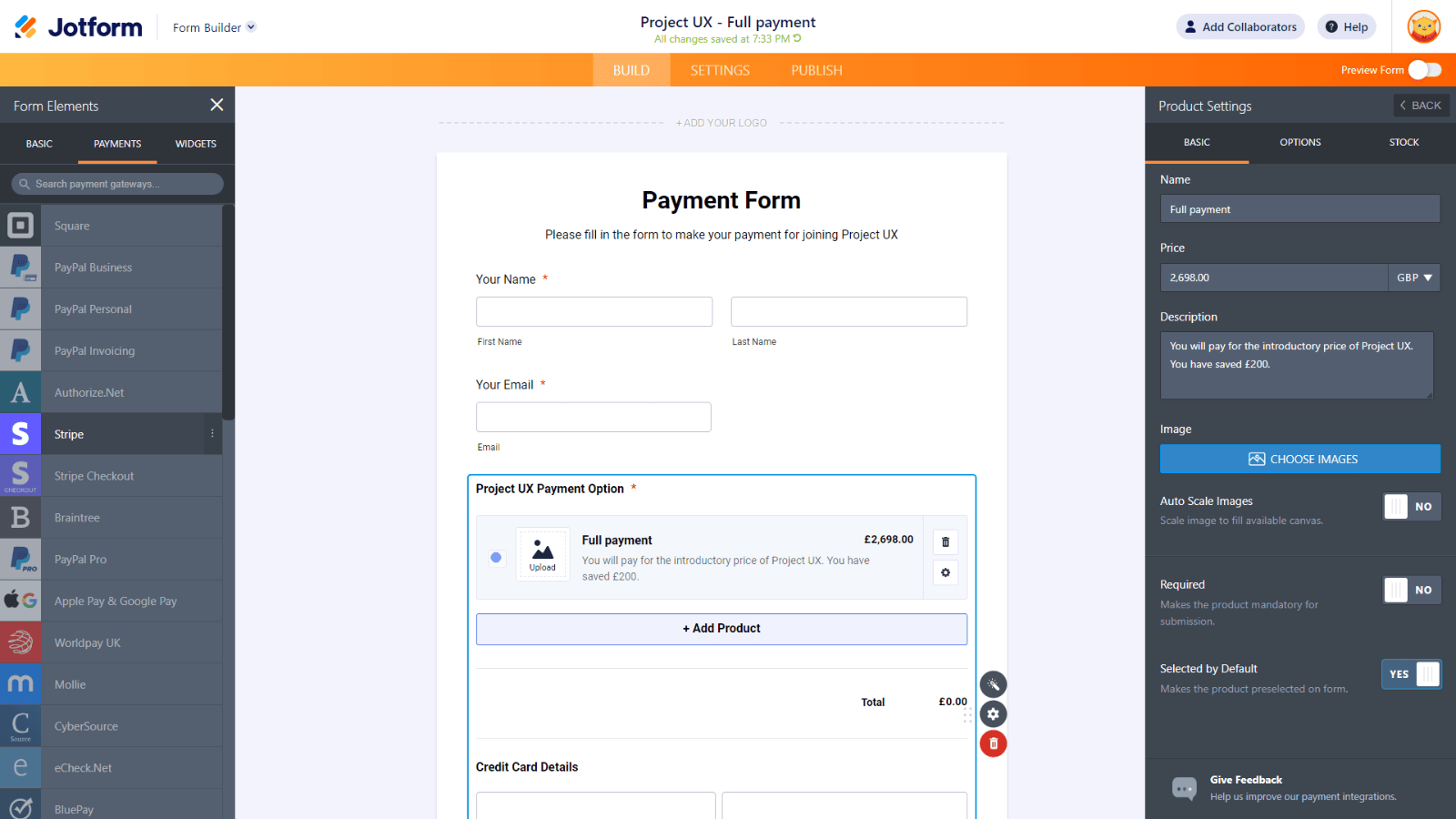
- Use a payment system that allows customers to pay in full or in three instalments
- Allow visitors to register their interest in joining Project UX
- Offer discount for UX Playground members who wants to join Project UX
- When Project UX launches, notify people who registered their interest
My previous experience in web design and front-end development made this process easier. Researching plugins/tools needed to implement the functionalities above is a common task (including communicating with third party support and troubleshooting issues). Since the website was built on Wix, we were limited in developing sophisticated processes e.g. payment system, so we only use supported third party plugins and platforms.
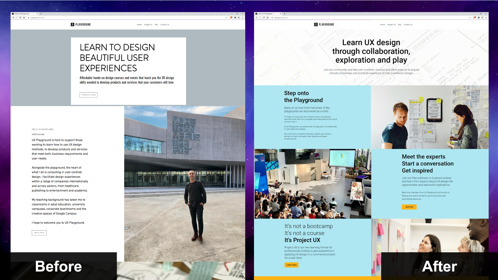
Redesigned for a better user experience
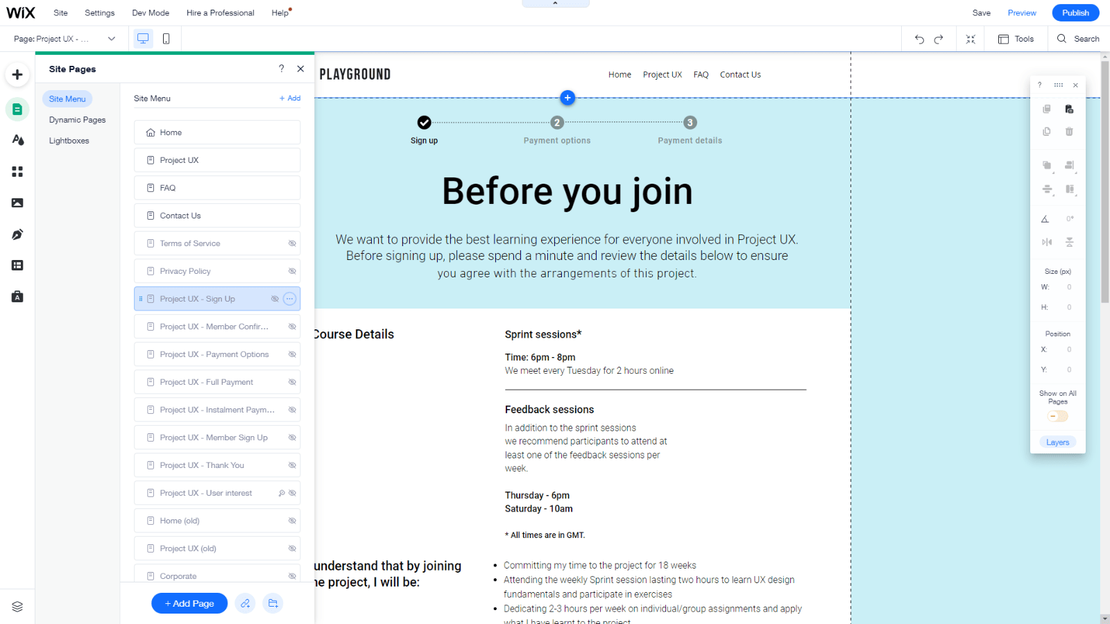
After implementing the website functionalities and finalising the content, the pages were created based on the new brand guidelines. View the website here.